Keeping a fixed div on resize
I want to make a menu to the left and right of the list. The menus should be fixed and I want them to always be 10 px from the list, even when I resize.
I made a "position: relative" list and I would like the menu to be positioned relative to the list.

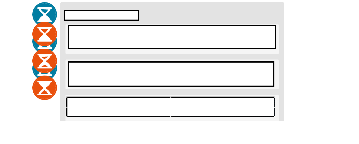
As you can see, I would like the orange buttons to be the same distance from the list as the blue buttons , even when I resize it.
I tried to use margins, left, right, padding ... but nothing works.
Here are some css I used:
With this css it looks like this:
.navblue {
float: left;
position: fixed;
}
.navorange {
float: right;
position: fixed;
}
.navblue ul {
list-style: none;
padding-left: 0;
}
.navorange ul {
list-style: none;
padding-left: 0;
}
#biglist {
background-color: #e3e3e3;
width: 80%;
padding: 20px;
border-radius: 5px;
color: #000;
border-color: transparent;
margin-left: auto;
margin-right: auto;
}
Thanks a lot if you can help.
source to share
Perhaps this is what you are looking for? http://jsfiddle.net/myjruLvr/9/
I added an extra parent <div>
outside of icons and main content and then gave it padding
equal to icons width + 10px margin
. And instead position: fixed;
, I used position: absolute;
.
Alternatively, you can also use the property float
for icons.
http://jsfiddle.net/myjruLvr/11/
This is an example. The icons float on their respective sides, and the centered <div>
will have margins
on both sides equal to the width of the + icons 10px
.
EDIT: You
seem to be asking for something like a sticky menu, but purely from CSS. Unfortunately, it position:fixed
positions the element relative to the browser viewport regardless of how it is positioned by the parent, and I guess that's pretty much the reason we have multiple jquery alternatives for this.
source to share
You need to add fixed positions. Update your CSS as shown below.
.navblue {
position: fixed;
left:0;
top:0;
}
.navorange {
position: fixed;
top:0;
right:0;
}
EDIT
Based on your comments below, here's the CSS update.
#container {
width: 100%;
padding-left:70px;
padding-right:70px;
box-sizing:border-box;
}
.navblue {
position: fixed;
left:0px;
top:0;
}
.navorange {
position: fixed;
top:0;
right:0px;
}
.navblue ul {
list-style: none;
padding-left: 0;
}
.navblue a {
display: block;
font-family: Pictoss;
font-size: 20px;
padding: 2px 20px 38px 20px;
background:#017da1;
width: 20px;
text-decoration: none;
overflow: hidden;
text-shadow: 0 -1px 1px black;
border-radius: 50px;
color: white;
height: 20px;
margin-bottom: 10px;
border: 5px solid #017da1;
-webkit-transition: all ease-in-out .3s;
-webkit-background-clip: padding-box;
}
.navorange a {
display: block;
font-family: Pictoss;
font-size: 20px;
padding: 2px 20px 38px 20px;
background: #e9500c;
width: 20px;
text-decoration: none;
overflow: hidden;
text-shadow: 0 -1px 1px black;
border-radius:50px;
color: white;
height: 20px;
margin-bottom: 10px;
border: 5px solid #e9500c;
}
.navorange ul {
list-style: none;
padding-left: 0;
}
#biglist {
height: 500px;
background-color: #e3e3e3;
width:100%;
border-radius: 5px;
color: #000;
border-color: transparent;
box-sizing:border-box;
}
source to share